CULTIVATED IMPRECISION
by Carlo Buffa
ANNOMILLE
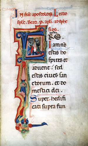
One morning while leaving the library attached to the cathedral in Padua I happened to run into Carlo Mazzacurati, who at that time was working on his new movie, “La Lingua del Santo” (“The Tongue of St. Anthony”). I myself was engaged in preparing a painstakingly exact copy of a page decorated by the 13th century Italian illuminator Gaibana for an upcoming exhibition and I happened to have with me a color reproduction of a page from a church service book that Gaibana had illuminated. Mazzacurati was looking around for a typeface to use for the titles in his film, and I agreed to design one for him.
His new movie was a modern comedy set in Padua and the surrounding area which nonetheless involved some strictly medieval motifs, and it seemed logical to use a lettering that would draw its inspiration from the graphic background of the middle ages.
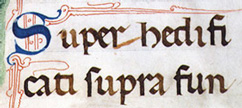
When it came time to start work on the typeface, I spent a lot of time writing out the title in different ways, but always with a broad-nibbed pen in the round gothic style of bookscript commonly used in Italy in the middle ages. Sometimes I did it freehand and sometimes I closely copied or even traced the medieval letters.

My initial idea was to compress the letters as much as possible and have them butt closely up against each other as was the custom in the examples I was copying from, and I often touched them up or evened out the outlines. But we finally realized that this round medieval gothic script was just not what we were looking for.
![]()