CULTIVATED IMPRECISION
by Carlo Buffa
ANNOMILLE
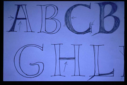
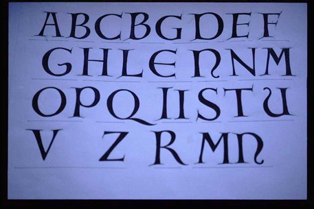
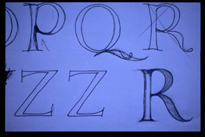
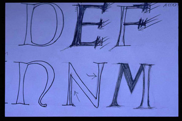
Once the graphic form of the title had been decided upon, the next step was to design all the required letters so I could do all the titles in the movie in the same form without having to do each one individually. This was a case where the font was created as a shortcut to save time and effort.
Free-hand sketches showing the development of the complete alphabet, with penciled corrections in halftone. The letters were digitalized on a scanner and then traced with the assistance of Adobe Illustrator.
![]()