CULTIVATED IMPRECISION
by Carlo Buffa
ANNOMILLE
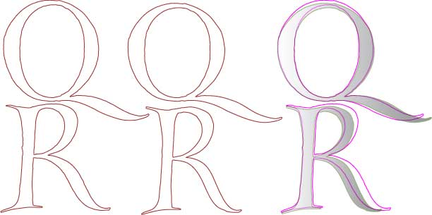
These letters differ in their proportions and dimensions. Variants take the place of the lower-case letters. The idea was to approximate the sensation one gets looking at a text written by hand in a style dependent more upon the rapidity with which it was carried out than upon that of the design behind it.
![]()

