CULTIVATED IMPRECISION
by Carlo Buffa
RITRATTI
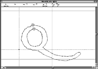
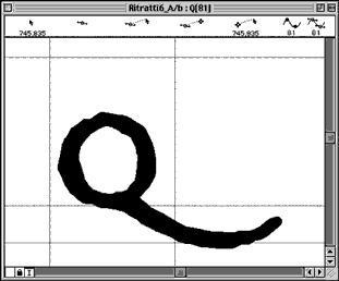
The font Ritratti was my second typographical foray into the realm of cinema. On the first occasion I had created the titles for the film “The Summer of David,” writing them by hand in ink and using a style of writing that was free rather than formal, one informed by instinct and gesture, similar to an extra bold sans serif. I learned from this experience that, in film, graphic subtleties come through much less clearly than on the printed page. When working with graphic design in the cinema, one must be ready to overemphasize and exaggerate the forms.
![]()